Unraveling the Super Bowl Logo Mystery: Tradition, Trends, and Team Colors
Explore the intriguing evolution of Super Bowl logos, their connections to team colors, and the cultural significance behind them.
The Super Bowl, as the pinnacle of the NFL, has captivated fans not just with thrilling games but also through its evolution in branding, particularly the logos that represent each matchup. As Super Bowl LIX approaches this year, the Kansas City Chiefs and Philadelphia Eagles will face off, continuing a remarkable trend: for the fourth consecutive season, the colors of the Super Bowl logo closely resonate with at least one of the participating teams. But is this just a coincidence, or is there more to the story?
A Colorful Connection
It all commenced with Super Bowl LVI, where the logo prominently featured orange and yellow, mirroring the Cincinnati Bengals and Los Angeles Rams. This was followed by Super Bowl LVII, showcasing green and red, aligning with the team's colors again, exemplifying a pattern fans have begun to notice. Super Bowl LVIII introduced purple and red, raising eyebrows before the Baltimore Ravens' loss to the Chiefs in the AFC Championship Game balanced the theory.
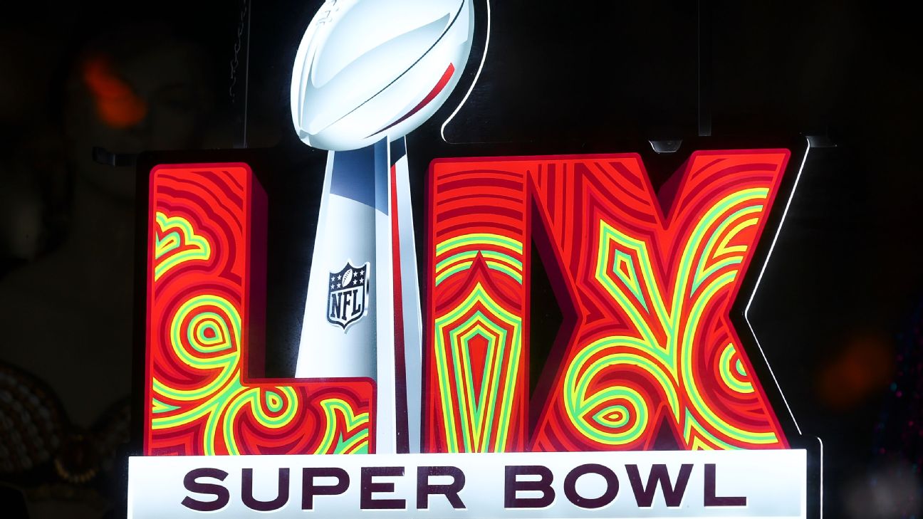
This year's logo brings a new narrative, crafted by local artist Tahj Williams, known as Queen Tahj. Instead of traditional New Orleans motifs, Williams designed an intricate Mardi Gras Indian patch dominated by red and green hues, paying homage to the rich cultural tapestry of New Orleans where African and Native American traditions intertwine poignantly.
From Simplicity to Sophistication
Historically, Super Bowl logos have transitioned from simplistic designs lacking in color and identity to intricate representations that embody market appeal and local culture. In the early days—from Super Bowl II in 1967 through to XLIV in 2009—colors like red, white, and blue typified the logos, giving way to more diverse palettes as the event transformed into a national spectacle.
According to branding expert Todd Radom, early Super Bowls had no formal logos as merchandise was minimal. As the NFL recognized an opportunity to monetize its merchandise in the early '90s, logos began to reflect localized themes, making logos like the peach from the Super Bowl XXVIII emblem emblematic of Georgia.
The Balance of Tradition and Innovation
Radom points out that as the NFL grew, so did the opportunity for artistic expression, leading to logos that encapsulated their locations uniquely. An emphasis on locality is evident with each subsequent design, but this also poses challenges regarding the evolving needs of the audience and market.
Gradations and intricate elements characterized logos from Super Bowl XLV onward. Yet, critiques ensued, dubbing them "no fun" due to their monochromatic simplicity. Despite a return to some thematic richness in recent years, some speculate that future designs might lean towards simpler aesthetics.
The Future Awaits
Looking ahead to upcoming designs, the blend of color and narrative behind the Super Bowl logo promises not only artistic expression but also cultural homage. As discussions around coincidence versus conspiracy continue to unfold, the logos remain tied to the stories of the cities they represent, worth dissecting for their connection to the teams vying for glory on the grandest stage of American sports.
In conclusion, whether viewed as mere chance or suggestive storytelling, the evolution of Super Bowl logos offers a fascinating glimpse into the intersection of sports, culture, and branding, revealing much more than just graphic elements. Stay tuned as the NFL unveils what’s next after this year's showdown!

Spain U21
00:00 Europe, Euro U21, Round 2

00:00

Romania U21

France U21
03:00 Europe, Euro U21, Round 2
03:00

Georgia U21

Portugal U21
03:00 Europe, Euro U21, Round 2
03:00

Poland U21

Slovakia U21
03:00 Europe, Euro U21, Round 2
03:00

Italy U21
St. Louis City SC
04:30 USA, MLS
04:30

Los Angeles Galaxy
What to Read Next